Blog Barista: Bob Marquis, CPA, PMP | June 26, 2019 | Project Management | Brew time: 5 min
A Value Plot is a graphical tool that I developed which can help you visualize the relative value of potential projects in several dimensions. This information, along with other organizational criteria, can greatly assist in the prioritization of projects. Every organization of any significant size goes through a process of prioritizing and selecting projects. The ultimate goal is to get the “most bang for the buck” when deciding where to allocate limited funds and resources.
A project Value Plot helps executives visualize the relative value of projects and when that value is expected to be realized. It highlights projects that can be expected to provide value in both the short-term and the long-term. This information should be considered as one factor in developing a sequential roadmap of projects. The Value Plot itself does not lay out the sequential/integrated roadmap for implementing projects. However, it does help guide the decision of which projects should and shouldn’t be on that roadmap in the first place. Optimal sequencing is typically done after project prioritization based on project interdependencies, resource availability, business constraints, etc.
A consulting case study that I led shows how the Value Plot tool can be used. I developed this tool during this engagement.
The client in this case is a major financial services company which I’ll call “Billco.” They provide software solutions to companies for revenue-cycle enhancement. Their software allows clients to collect online payments of various types. Banks for instance, use the software to accept loan payments online. Utility companies use the software to allow customers to make online utility payments. Convenience stores use the software to allow customers to make utility payments at their store.
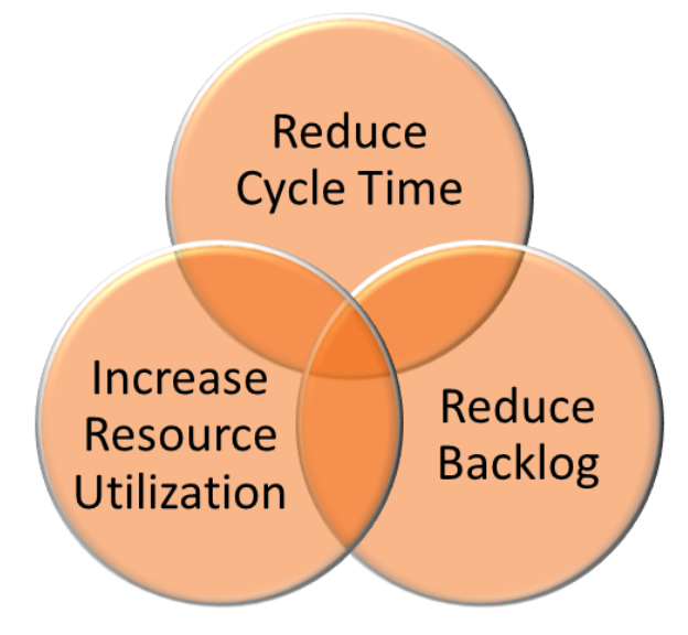
The software has to be configured, and sometimes customized for each of Billco’s new clients. Billco was struggling with poor client satisfaction because implementations were simply taking too long. The COO identified three strategic imperatives:
1. Reduce end-to-end cycle time of client implementations
2. Increase resource utilization
3. Reduce the backlog of projects (or, as he liked to say, “drain the swamp”)
The engagement team identified a number of initiatives to make improvements in these three areas. The difficulty was presenting these initiatives to executives in a way that they could decide where to allocate limited investment funds for short-term quick hits as well as to start longer-term improvements.
Using just the traditional Net Present Value (NPV) calculation didn’t provide enough insight into when they could expect to start seeing results. It also didn’t consider the complexity and risk involved in each initiative. More dimensions were needed to convey this information.
I constructed a Value Plot using a bubble chart that conveyed information in three dimensions rather than just two. It also included categorization of the initiatives by the three imperatives using colors. Finally, it highlighted the top 5 recommended initiatives. See the plot below.

Each improvement initiative is represented as a bubble on the chart. The chart has the usual x and y axes for two dimensions, but the size of the bubbles conveys a critical third piece of information.
The vertical y-axis reflects the cost/complexity of each initiative, from low to high. This can be determined simply by using cost, or by using other methodologies to quantify the complexity of an initiative.
The horizontal x-axis is the Timeframe to initial results. This tells the executives when they can expect to start seeing benefit from the initiative.
The third dimension, the size of the bubble, is the expected impact of the initiative on a particular imperative. This is best in NPV but impacts can also be quantified in other terms. A large bubble represents a large impact. The bubbles are color coded to show the strategic imperative to which each initiative is aligned. The top five recommended initiatives are called out in orange background. Note that the top five recommendations were skewed toward the two imperatives of Cycle Time Reduction and Increased Resource Utilization. Two other “runner-up” recommendations, in light green background, focused on Backlog Reduction.
Using this chart, executives could get their arms around how they might want to allocate their investments for short-term and long-term benefits and how they might balance their investments over the three strategic imperatives.
As an example, project managers were not well-versed in complex financial security requirements, that often changed, and that had to be met for implementations. Excessive cycle time was lost trying to show compliance and trying to obtain the data security group’s approval to implement. The engagement team recommended assigning a dedicated Security Liaison to take on this responsibility for all projects. This was someone who knew how to navigate the process, kept up with changing requirements, and could write in terminology that would ensure approval. The bubble on the graph shows that this initiative was easy to implement, could be done quickly, and would have a significant impact on the strategic imperative of reducing cycle time.
A second example was the recommended initiative to implement automation tools, primarily for environment configurations and regression testing. Benchmarks showed that too many resources were being used to manually configure and re-configure environments and to do regression testing. The plot shows that using Automation tools for these tasks would significantly improve resource utilization. However, this would be a more complex and costly initiative and it would take longer to see results.
It’s important to recognize that the project Value Plot is a presentation tool. It is an end result. It is only generated after doing the difficult work that is required to analyze and quantify the initiatives that are ultimately represented on the plot. Once that work is done however, the Value Plot is a very helpful tool to boil the results down and convey the essential information that executives need to make decisions.
Other recent posts:

Kunz, Leigh and Associates (KL&A) Announces the Retirement of KL&A Co-Founder John Leigh
OKEMOS, MI, April 11, 2023 – Kunz, Leigh and Associates (KL&A) announces the recent retirement of KL&A Co-Founder John Leigh as of March 31, 2023. Mr. Leigh began his career as a developer working on large mainframe systems before moving…

Team Building in a Remote Environment
Blog Barista: Dana Graham | June 15th, 2022 | Culture | Brew time: 5 min
Let me start by saying I don’t care for the term “work family.” I have a family I love, and they have absolutely nothing to do with my career. I want my work life to be its own entity. I like boundaries (and the George Costanza Worlds Theory). Certainly, I want to enjoy and trust my coworkers, and I want to feel supported and cared for…
0 Comments